B2B Sales
Examples of Effective Sales Rep Comparison Charts
Mar 20, 2026
Visualize sales performance with productivity, actuals-vs-target, and leaderboard charts to spot trends, gaps, and coaching opportunities.

Sales rep comparison charts offer a clear, visual way to evaluate performance, identify challenges, and improve outcomes. These charts simplify raw data, making it easier to spot trends, compare metrics, and make informed decisions. Whether you're tracking productivity, quota attainment, or team rankings, these tools help you focus on what matters most.
Key Takeaways:
Rep Productivity Charts: Use bar charts or scatter plots to analyze activity levels, conversion rates, and efficiency.
Actuals vs. Target Charts: Highlight gaps between goals and results with bullet, grouped bar, or gauge charts.
Leaderboard Charts: Motivate your team with rankings, gamification, and performance trends.
Quick Comparison:
Chart Type | Best For | Visualization Style |
|---|---|---|
Rep Productivity | Spotting trends, efficiency | Bar charts, scatter plots, heatmaps |
Actuals vs. Target | Tracking quota attainment | Bullet charts, gauge charts |
Sales Leaderboard | Ranking and motivation | Bar charts, heatmaps, progress bars |
These charts are more than visuals - they guide actions. Tools like Coach Pilot integrate real-time insights and AI-driven coaching to turn data into measurable improvements. Start with the right chart, focus on the right metrics, and drive results.
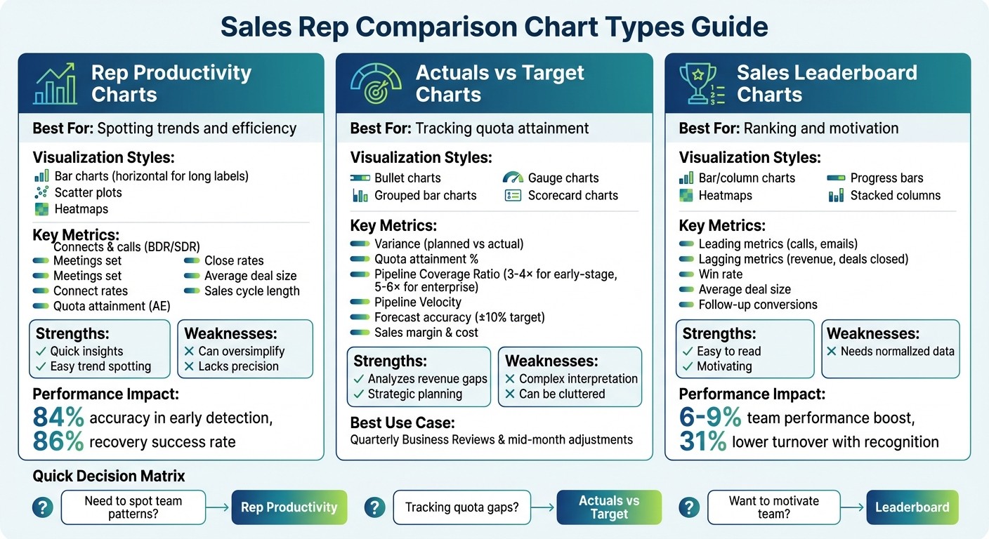
Sales Rep Comparison Chart Types: Features, Best Uses, and Pros vs Cons
1. Rep Productivity Comparison Chart
Visualization Style
When it comes to comparing rep productivity, bar charts are the go-to option. Why? Because our eyes are naturally good at judging bar lengths accurately [3]. If your labels or rep names are on the longer side, horizontal bars work better than vertical ones [6]. For a deeper dive, heatmap matrices use color intensity to quickly show performance across several KPIs [5]. And if you're looking to uncover patterns, scatter plots are perfect for spotting correlations - like comparing deal volume to average deal size to find reps who close fewer deals but at higher values [3].
One key rule: always use a shared y-axis for comparing rep data. Autoscaling might make a low performer's chart look misleadingly similar to a top performer’s, leading to wrong conclusions [1]. Also, sorting bar charts from highest to lowest value helps viewers instantly grasp the rankings [6].
These visualization methods lay the groundwork for pinpointing the metrics that matter most in driving rep performance.
Key Metrics Highlighted
Good charts strike a balance between Quantity (activity levels), Quality (conversion and win rates), and Efficiency (output relative to effort) [8]. For BDRs and SDRs, focus on metrics like connects, calls, meetings set, and connect rates. For Account Executives, prioritize quota attainment, bookings, close rates, average deal size, and sales cycle length [4].
Here’s an example: an AI alert flagged a rep struggling with non-ICP (Ideal Customer Profile) leads. After realigning their focus, their quota attainment jumped from below target to 112% - and it only took five days [9]. This illustrates the importance of tracking ICP precision, which measures how well prospects align with your ideal customer profile. In another case, AI-powered targeting improved ICP precision from 52% to 78%, cutting wasted effort on mismatched leads by nearly half [9].
Tracking these metrics provides actionable insights into performance challenges and opportunities.
Use Cases
Productivity charts are powerful tools for spotting bottlenecks in the pipeline and uncovering "vanity metrics" - those flashy numbers that don’t drive real results, like high activity paired with low conversions [1][8]. To make the most of your metrics, assign more weight to impactful actions, like delivering proposals or demos, instead of just tallying outbound calls [2].
Real-time productivity alerts take this a step further. These alerts can identify performance dips two to three days before they become obvious, with an impressive 84% accuracy rate. Acting on these alerts has led to an 86% success rate for recovery, compared to just 38% for reactive management [9]. By integrating these insights with AI-driven coaching tools like Coach Pilot, teams can turn data into measurable improvements - boosting win rates and shortening sales cycles. In short, productivity charts aren’t just about tracking performance; they’re about catching issues early and driving better results where it counts most.
2. Actuals vs Target Performance Chart
Visualization Style
When it comes to comparing actual sales against quotas, bullet charts are a great choice for compact dashboards, offering a clear and efficient layout [3]. If you're analyzing multiple reps side by side, grouped bar charts work well to keep comparisons organized. For a more direct view of the gap between actuals and targets, overlapping bar charts are ideal [3][10].
Gauge charts are another option, especially for quickly displaying key metrics like total team quota attainment [3]. Meanwhile, scorecard charts provide a straightforward look at actual values versus baseline targets, often with visual indicators showing percentage increases or declines [4]. To ensure accuracy, always start the y-axis at zero - this avoids exaggerating small differences [3]. When comparing multiple reps, using a shared y-axis ensures performance gaps are fairly represented across the board [1].
Once you've selected the right visualization, it's time to focus on the metrics that matter most for understanding performance.
Key Metrics Highlighted
At the heart of any actuals vs. target chart is the variance, which highlights the gap between planned and actual results [10]. Quota attainment is another critical metric, showing what percentage of the target has been achieved and helping identify who’s on track and who’s falling behind [11]. For insights into pipeline health, consider tracking the Pipeline Coverage Ratio (pipeline value divided by quota) and Pipeline Velocity, which measures how much revenue your pipeline generates daily [12]. For high-performing teams, early-stage sales typically require 3–4× coverage, while enterprise sales often need 5–6× [12].
Another important metric is forecast accuracy - top-performing teams aim to stay within a variance of ±10% [12]. Efficiency metrics like Sales Margin and Sales Cost compared to targets can also help pinpoint your most profitable products and customers [13]. For individual reps, tracking commission progress alongside quota attainment ensures their focus remains on high-value activities [11].
These metrics are the backbone of effective performance tracking and decision-making.
Use Cases
Actuals vs. target charts serve as an excellent visual scoreboard during Quarterly Business Reviews. They provide executives with a clear, high-level snapshot of whether the team is meeting strategic goals [10]. In one-on-one coaching sessions, scorecards help drill down into specific gaps, turning general performance concerns into actionable steps [4]. Perhaps their greatest strength lies in enabling proactive adjustments. By identifying issues mid-month, managers can tweak strategies before it’s too late to course-correct [10][14].
For added motivation, leaderboards based on target achievement encourage healthy competition among reps by ranking performance in real time [2][4]. With modern dashboards that sync directly with CRMs like Salesforce or HubSpot, your data stays current, empowering faster, data-driven decisions [12][11].
"A great sales dashboard answers that question [How's the pipeline looking?] in 3 seconds - and gives you the insights to hit your number" [12].
3. Sales Leaderboard Ranking Chart
Visualization Style
Bar and column charts make it easy to compare performance side by side, while line charts and sparklines are perfect for showing trends over time [17][4]. Stacked column charts are especially useful for breaking down revenue components, such as base subscription income versus upsell contributions, for each sales rep [4].
Adding gamified elements like progress bars, badges, and streaks provides immediate feedback and encourages friendly competition [15][16]. Heat maps and conditional formatting use color scales - green for high performers and red for low performers - so managers can quickly identify top and bottom performers across various metrics [4]. For larger teams, segmented leaderboards ensure fair comparisons by grouping junior reps separately from more experienced ones [16].
These visualization techniques not only showcase rankings but also help define critical performance metrics.
Key Metrics Highlighted
To make leaderboards effective, they should balance leading metrics (like the number of calls or emails) with lagging metrics (such as revenue generated or deals closed) [19]. This approach helps reps understand how their daily activities contribute to overall results [4]. Additionally, efficiency metrics like win rate and average deal size can reveal skill gaps or areas where processes might need improvement [18][4][19].
Interestingly, gamifying sales activities through leaderboards can boost team performance by 6% to 9% [18]. Features like missions, challenges, or earning raffle tickets for each sale keep newer reps motivated while maintaining high morale across the team [21][17].
Use Cases
Leaderboards are a great way to boost engagement by incorporating points, badges, and rewards [20][16]. During coaching sessions, managers can use leaderboard data to identify specific issues, such as low follow-up conversions or slow response times [20][4]. They also provide operational transparency, giving reps real-time insights into their performance, which helps them self-correct and align their efforts with company goals [20][19].
When combined with productivity and performance charts, leaderboards offer a complete view of sales performance. For remote teams, digital leaderboards act like a virtual water cooler, fostering a sense of community and shared objectives despite physical distance [16]. Companies that integrate recognition into daily workflows report a 31% lower turnover rate [20].
"Spinify gives us the capability to connect directly to Salesforce, so our reps can see their realtime activity cadence, and know how close they are to reaching milestone, or overtaking a colleague."
Steve Munccini, Senior Sales Enablement Manager at Forcepoint[15]
Platforms like Coach Pilot (https://coachpilot.com) take this a step further by integrating leaderboard analytics with advanced training and AI-driven coaching. This combination allows teams to act on insights in real time, improving win rates and shortening sales cycles. These tools set the stage for a well-rounded evaluation of leaderboard impact.
How to Do Sales Performance Review with Charts in Google Sheets #dataanalysis
Pros and Cons
Every chart type has its own set of strengths and weaknesses, making it essential to weigh these factors when building a sales dashboard. By understanding these trade-offs, you can select the visualizations that best suit your team's goals. Let’s break down the advantages and limitations of each chart type discussed earlier.
Rep Productivity Comparison Charts are great for delivering quick insights. They make it easy to spot performance trends at a glance, with bar charts being especially effective since the human eye is naturally good at comparing bar lengths [3]. That said, these charts can sometimes oversimplify complex scenarios. For instance, a high average might be skewed by a single outlier, masking a decline among other team members [22]. Additionally, without data labels, it can be tricky to pinpoint exact values - was that bar 102 or 105 units? [22].
Actuals vs Target Performance Charts are excellent for identifying specific actions to address revenue gaps [25][26]. They’re particularly useful in strategy discussions and forecasting, helping teams assess if they’re on track to meet quarterly goals [25]. However, these charts can be harder to interpret compared to simpler visualizations like leaderboards. The cognitive effort required to understand variances or "distance to goal" can slow down decision-making [25]. Plus, when too many data series are included, combo charts can become visually cluttered [7].
Sales Leaderboard Ranking Charts provide a clear snapshot of who’s excelling and who might need extra support [24][26]. They’re ideal for team meetings, fostering healthy competition, and identifying top performers whose strategies can be shared [3][24]. But, these charts require normalized data for accurate comparisons over different periods; otherwise, rankings could be misleading [3].
To make the best choice, consider these pros and cons alongside the visualization best practices mentioned earlier. Here’s a quick summary of the trade-offs:
Chart Type | Primary Strength | Key Weakness | Best Fit |
|---|---|---|---|
Rep Productivity | Can hide details and lacks precision [22] | Spotting team-wide patterns and anomalies | |
Actuals vs Target | Requires more mental effort to interpret [25] | Strategic planning and quota tracking | |
Sales Leaderboard | Needs normalized data for accuracy [3] | Team meetings and coaching opportunities |
Conclusion
Pick a chart that aligns with your sales goals. For quickly spotting team-wide patterns, rep productivity charts provide instant clarity. If you're analyzing quota attainment or explaining revenue gaps during strategy meetings, actuals vs. target charts give you the detailed breakdowns you need. And when it’s time to motivate your team or identify coaching opportunities, leaderboard rankings highlight top performers while offering insights for growth. This approach ensures you focus on the right metrics and unlock insights that drive action.
Start by understanding your data type - whether it’s categorical or quantitative - and your goal, such as comparison, relationship, composition, or distribution [23][27]. With these elements in mind, choose a chart that communicates your message clearly and accurately [3][23].
But remember, charts are just the beginning. They tell you what happened, but not what to do next. Platforms like Coach Pilot bridge that gap by turning insights into actionable steps. For instance, if comparison charts show certain reps falling behind, Coach Pilot’s AI delivers real-time guidance, helping reps refine their approach - whether it’s crafting the perfect pitch to a CFO or overcoming a specific objection [28]. This tool scales your top performers’ expertise across the team with 24/7 AI-driven support.
The impact is tangible. Take Connor Bell, a BDM at HubSpot, as an example. In June 2024, he used Coach Pilot to boost his results significantly - creating 50% more net new opportunities, closing 12 deals in just 11 weeks, and driving a 38% increase in quarterly sales revenue [28]. By pairing effective data visualization with targeted coaching, you turn passive insights into measurable performance gains that make a real difference in your quarterly reviews.
FAQs
Which chart should I use for my sales dashboard?
A comparison chart, such as a bar chart or a comparison matrix, works perfectly for highlighting differences and similarities on your sales dashboard. These visual tools make it easier to present data in a clear, straightforward way, helping your team quickly grasp key insights.
What sales rep metrics should I compare by role?
When evaluating performance, consider metrics such as activity levels, conversion rates, quota attainment, productivity KPIs, and coaching impact. Align these metrics with the specific responsibilities of each role to ensure the comparisons provide relevant insights and lead to actionable strategies.
How do I keep sales charts from being misleading?
To create sales charts that are clear and honest, prioritize accurate design and data representation. Choose the right chart type for your data, and make sure the axes are properly scaled - don’t skip zero or truncate it unless absolutely necessary. Avoid cherry-picking data points to skew the narrative. Be mindful of any visual distortions or manipulative design choices that could mislead viewers. Regularly reviewing these elements helps ensure your charts remain trustworthy and provide a true reflection of the data for better decision-making.
Related Blog Posts

Remove the guesswork from winning more deals.
